Loading
MEANING · PAIN MAP · AGING
TattoosMap — Be Unique
Gallery/ Gallery / Memento Mori Hands Tattoo Design — Meaning
celestial mystical
Memento Mori Hands Tattoo Design — Meaning
mortalitymindfulnessacceptanceresilienceillustrativeblackworkfine-linestippling
4 Saves 175 Views
GenderMen and Women
PlacementCHEST, FOREARM, UPPER BACK, THIGH, RIBS
StyleBlackwork
Design Tags
Story & Origin
Meaning &
Symbolism
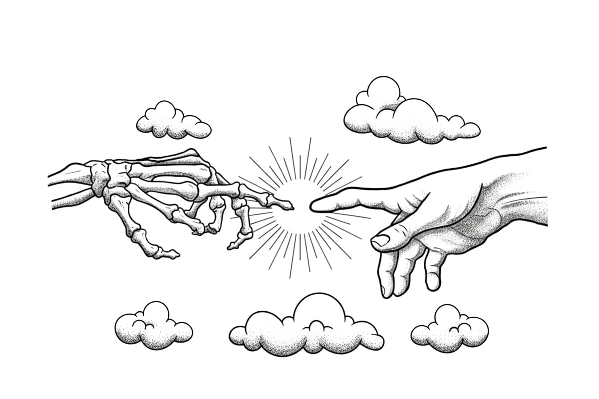
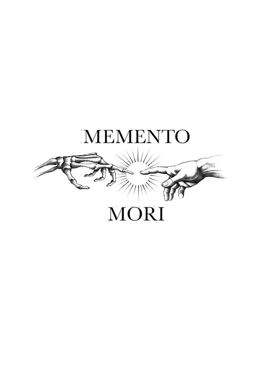
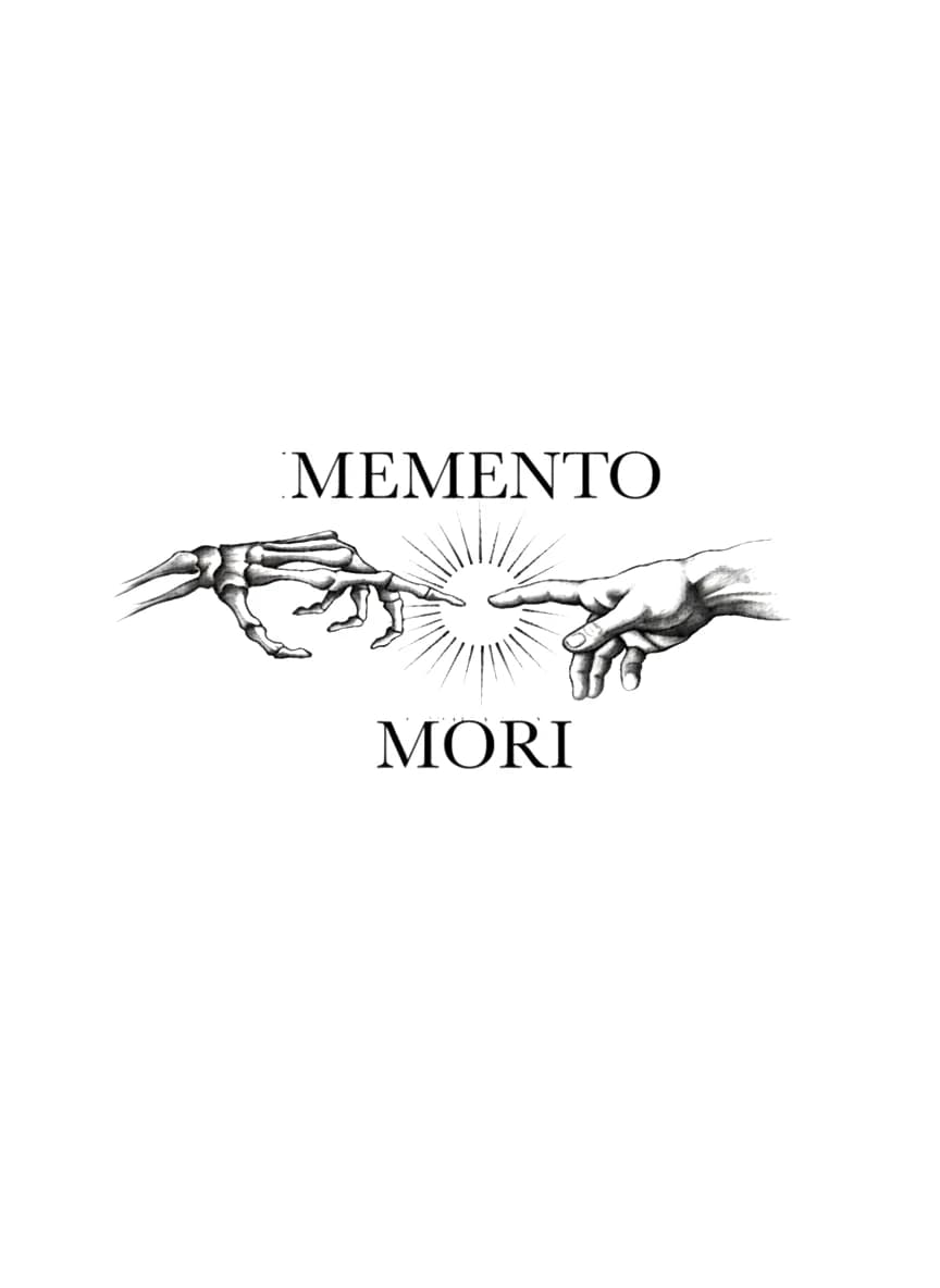
Memento mori translates from Latin as 'remember that you must die,' serving as a profound philosophical reminder of mortality, impermanence, and the importance of living a purposeful life. Reinterpreting Michelangelo's iconic *Creation of Adam*, the composition juxtaposes living human flesh reaching toward skeletal bone, capturing the eternal dialogue and fragile boundary between existence and the inevitable return to dust.
Cultural Heritage
Ancient Roman Stoic philosophy combined with Italian High Renaissance art.
Core Narrative
An illustrative Memento Mori tattoo design featuring a detailed skeletal hand reaching toward a human hand with a central sunburst.
Artist Insight
Technical
Detail
Specific needle mapping and specialized care configurations suggested for professional application.
Artist
PROMinimum Size
12 cmNeedle Config
3RL for stipple shading and radial rays; 5RL for serif lettering and structural outlinesLine Complexity
Fine / Multi-layerTechnique
Fine Line / StippleTechnician's Notes
Use a tight 3RL with varying greywash dilutions to build smooth, peppered shading across the phalanges and muscle anatomy. Pull crisp, single-pass lines for the serif typography using a 5RL, taking care not to overwork the letter corners. Ensure the radiating sunburst lines have consistent tapering and open negative space at the center to prevent ink dispersion from closing the gap over time.
Longevity Forecast
Over 5 to 10 years, the delicate stippled shading within the hand muscles and bone contours will soften, blending into subtle gradient washes. The ultra-fine lines of the central sunburst will expand slightly, making adequate spacing essential during application so they do not merge. The high-contrast serif typography will hold strong readability over decades if applied at the correct depth.
Pain Assessment
Sensitivity
Density
Detailed sensitivity density indicators correlated to your chosen placement positions.
Calflow
Foothigh
Neckmedium
Ribshigh
Anklemedium
Chestmedium
Thighlow
Wristmedium
Stomachhigh
Shoulderlow
Upper Armlow
Behind Earmedium
Forearm Innerlow
Forearm Outerlow
Shoulder Blademedium
Pain levels are subjective and vary by individual tolerance. These ratings reflect general consensus for fine-line application techniques.
Healing & Aging
Natural
Evolution
Over 5 to 10 years, the delicate stippled shading within the hand muscles and bone contours will soften, blending into subtle gradient washes. The ultra-fine lines of the central sunburst will expand slightly, making adequate spacing essential during application so they do not merge. The high-contrast serif typography will hold strong readability over decades if applied at the correct depth.

Day OneFresh Ink
Sharp
5 Years +Healed Ink
Natural Fade
Care & Longevity Guide
High-friction placement accelerates natural fading. Annual touch-ups recommended. Apply SPF 50+ sunscreen daily once healed to protect ink pigment from UV breakdown.
LONGEVITY GRADEGRADE B+
STYLE MATCH